Colours and Themes
How we use colour schemes across Howden websites
Primary colours
The digital brand palette derives directly from the master brand with some necessary adaptations to meet accessibility standards. The pairings shown here are the ones specifically adapted or permitted for digital use.
To create a simple and accessible reading experience, we use high contrasts and limit the use of certain colours.
Cobalt blue
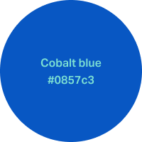
- Cobalt blue: #0857c3
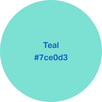
- Teal: #7ce0d3
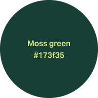
Moss green

- Moss green: #173f35
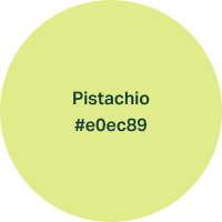
- Pistachio: #e0ec89
Gold
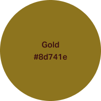

- Gold: #8d741e
- Rosewood: #3c0f11
Rosewood
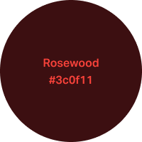
- Rosewood: #3c0f11
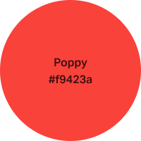
- Poppy: #f9423a
Secondary colours
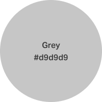
Our secondary palette introduces greyscale tones to support our primary colours.
These tones have been adapted from our master brand palette and optimised for digital use.
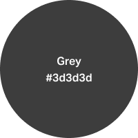
Grey #3d3d3d is to be used for the body copy and headings in the body area.
Greys with tints are used in locations that we don’t want to draw attention to, such as backgrounds in components and placeholders in forms.
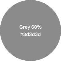

- Grey 60%: #3d3d3d
- Grey 10%: #3d3d3d
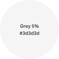
- Grey 5%: #3d3d3d
White is primarily used for body background and CTA (call to action) buttons text colour.
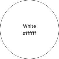
- White: #ffffff
Colour Themes
We have created colour themes based on the brand colour pairings.
Ensure that only connecting brand colours are visible in the browser viewport. If you want to transition from the main page theme into other colours, use white to break up the sections.
Note: User testing found that too much rosewood could feel aggressive. Use this theme sparingly.
Cobalt blue


- Cobalt blue: #0857c3
- Teal: #7ce0d3
Moss green

- Moss green: #173f35
- Pistachio: #e0ec89
Gold


- Gold: #8d741e
- Rosewood: #3c0f11
Pistachio


- Pistachio: #e0ec89
- Moss green: #173f35
Gold

- White: #ffffff
- Gold: #8d741e
Rosewood


- Rosewood: #3c0f11
- Poppy: #f9423a
Private clients theme

- White: #ffffff
- Grey: #3d3d3d