Fixed Image and Text Scroll
Break up long-form pages
Best practice demo
A short heading per block
Here's how this component can liven up – and break up – the page in a dynamic and visually striking way.
You can align these text blocks left or right, depending on the layout of the rest of the page (though left is the default).
Quick tips:
- Aim for two to three blocks in total for this component.
- Opt for fewer boxes with more text over lots of boxes containing less text.
- Keep paragraphs to no more than four lines, to avoid walls of text.
Images must be landscape orientation
The fixed image this box overlays needs to be between 1,600 and 2,000 pixels wide. Otherwise, the image will stretch to fit the shape, making it distorted and blurry.
The image you choose should complement your subject matter or message. You may need to try a couple of different options, depending on which parts of the image the boxes obscure as users scroll.
Keep headings under two full lines
This component looks best with a minimum of 150 words in each text block.
Use the Rich Text Editor to format and style your text. This can help break up copy and aid readability (and scannability) for users.
So consider options such as:
Headings (H4, H5)
- Bulleted or numbered lists
- Hyperlinks to relevant or related content
- Bold to highlight key words or phrases
Use bold sparingly and selectively, though. Too much bold copy can make the information harder to read, and risks overloading the user.
This isn't the place for lengthy, very detailed copy. If you have more to say than is easily digestible in this box, make some cuts. Could that information go elsewhere on the page?
Usage guidance
Overview
Break up long-form pages
Fixed Image and Text Scroll brings kinetic energy to the page. A full-width image stays anchored to the screen while text boxes move across it as the user scrolls.
The use cases for this component are limited. But there are some situations where it’s exactly what you need.
When to use
Fixed Image and Text Scroll is a good option for:
- Making a very long page feel like a destination, such as the homepage of a microsite
- Signifying a break in the content with a change of scenery
- Adding variety after several uses of the same component, such as Editorial Block with Sidebar
When not to use
Having an H2 after the H1 is essential for SEO. Fixed Image and Text Scroll doesn’t support an H2. So make sure you always use a component that facilitates an H2 first, such as Body Text.
How to use it
Step 1: Choose an image
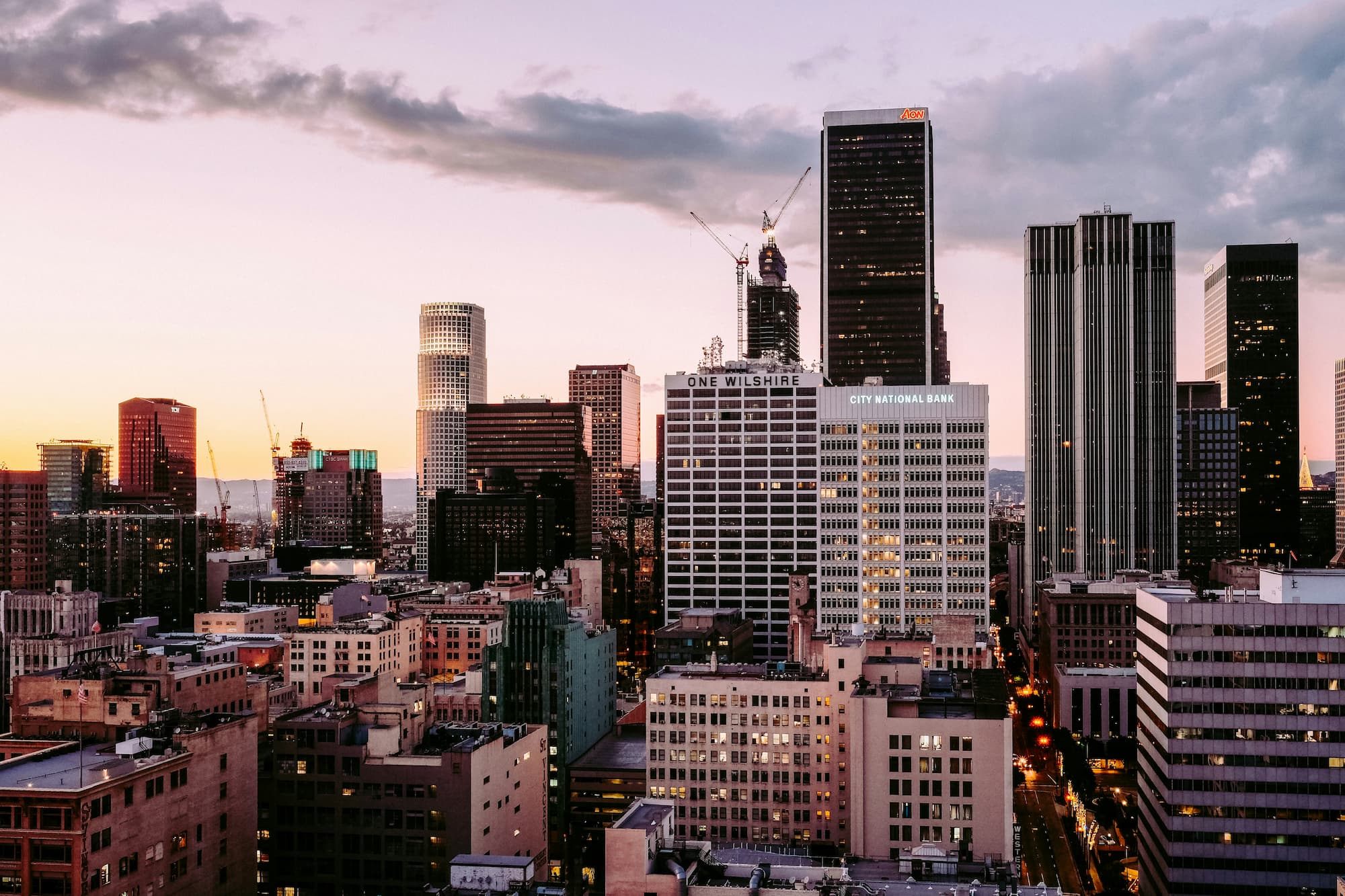
When choosing an image, bear in mind that portions of the frame will be obscured by the text boxes as the user scrolls. So the image should be easy to understand, even with elements missing. Cityscapes, landscapes, and architecture are good choices. By the same token, you should avoid using images where the focal point is a person.
It’s important to use a large, high-quality image. Otherwise, the image will stretch and distort to fit into the shape. Make sure that the image is 1600-2000 pixels wide.
Step 2: Upload the image
Choose ‘select image’. You can choose an existing image or upload a new one.

To upload a new image, select ‘import image', then ‘select file’.

Add a title and alternative text, then choose ‘select image’.
For more information about uploading images to the CMS, see the ‘Image Basics’ advice.
Step 3: Add your text
You add your text to individual ‘text blocks’. Each text block should be introduced with a heading. Keep it within two lines and don’t use a full stop.
Use the Rich Text Editor to format and style your text. You can also make lists and link out to other content from here.
Fewer boxes with more text in each one is better than lots of smaller boxes. Aim for two or three text boxes with at least 150 words in each one (and around 200 words maximum).
Recommended image specifications
The background image fills the entire screen and responds to the shape and size of your browser.
As most users will be viewing this with a landscape orientation we recommend using a landscape image. However, bear in mind that some users will view this on a tablet or mobile in portrait orientation and as such the image will get cropped both on the left and right in order to fill the screen. With this in mind the main content of the image should be in the center and not towards the left and right edges.
The file size of the image should not exceed a maximum of 250kb, the smaller the file size the better but the image should still be crisp and non-blurry.
| Format | Orientation | Dimensions | File size |
| JPG | Landscape | 1600 x 1200px | <250kb |
Notes: Depending on the left/right option chosen, the main focus of the image should not sit behind the content.
For more information on how to use images in the CMS go to the Image Basics page.
Do's
Choose a large, high-quality image
Images need to be 1,600 to 2,000 pixels wide to display correctly.
Don'ts
Don’t use distracting images
The image should support, not overpower, the text.