Image and Call to Action
Promote related content
Best practice demo
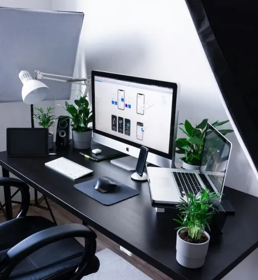
Text and a suitable image
A striking, thematically relevant image helps draw the eye to the corresponding text. Choose an image that complements your text.
Bear in mind that images for the Image and Call to Action component should be square. This adds a variety to the layout, distinguishing the component from similar components like Editorial Block with Sidebar.
When using multiple instances of Image and Call to Action, alternate the alignment of the columns. This helps to maintain visual interest.
Tell users what to expect
Image and Call to Action is all about encouraging users to interact with the call to action button. That means having compelling, action-oriented text, right from the heading and down to the button text.
Make sure users know what value they will get. Use clear, benefit-led button copy. For example:
- Download report
- Sign up now
- Get in touch
- Find out more
Usage guidance
Overview
Promote related content
Image and Call to Action is a flexible option for presenting text. Delivering up to 200 words, it also supports an image and a call to action button in the parallel column.
It’s a good way of:
Introducing a related page
Signposting resources like reports and brochures
How to use it
Step 1: Choose an image
You can select an existing image or import a new one.
To upload a new image, select ‘import image', then ‘select file’.

Add a title and alternative text, then select ‘select image’.
You can choose which side of the page to place the columns on using the ‘layout’ checkbox.

Alternate the orientation of the columns to maintain the overall balance of the page.
For more information about uploading images to the CMS, see the ‘Image Guidelines’ advice.
Step 2: Add the text
Use the text feature to explain why users should visit the content you’re linking to.
To add text, you’ll need to make a content block. Select ‘add new content block’ to get started.

Block description
The block description is the name of the content block. It won’t appear on the page – it’s there to help you and other CMS users find the content block in the CMS. For simple identification of the content block, give it a unique, context-specific name.
Heading
The heading is an H2 designed to set up your content. It should motivate users to read on.
Don’t use two full lines for the heading, as this can be hard to scan. Keep to within about eight words (50 characters).
Text
The text box supports up to 200 words with a portrait image and 100 words with a landscape image.
Select the ‘use Rich Text Editor’ checkbox to format your copy, including bulleted and numbered lists.

Step 3: Make the call to action button
Find the content you want to link to and copy the URL. Paste the URL into the ‘button URL’ text field.
To encourage users to interact with the call to action button, it’s important to have compelling, action-oriented button text. That means the text should tell users what to expect. For example:
- Download report
- Sign up now
- Get in touch
- Find out more
Add the button copy to the ‘link text’ field.
Recommended image specifications
For this component you can use both landscape or portrait images.
If you upload a portrait image you should make sure that the content alongside it is long enough to not make the component feel unbalanced.
This is a responsive component so as such the image width will increase or decrease depending on the size of your screen. The maximum width the image will ever be is around 750px when viewed on a large mobile or small tablet, so we recommend using an image with a width of 800px. You do not need to set the height to any particular value as it will be depend on the format of the image you use.
The file size of the image should not exceed a maximum of 100kb, the smaller the file size the better but the image should still be crisp and non-blurry.
| Format | Orientation | Dimensions | File size |
| JPG | Landscape or portrait | Width: 800px | <100kb |
For more information on how to use images in the CMS go to the Image Basics page.
Do
Check the call to action button
Make sure the button links to where you expect before publishing.
Don't
Don’t write a big wall of text
Use paragraphs containing no more than four sentences.