List Spotlights
A flexible tool for presenting text and links
Best practice demo
Make a list
You can use the 'title' text field to create a simple list – a useful additional option in place of bulleted lists.
Just a heading
For each list point
No supporting copy
Present key points
Combine headings and explainer copy to present key points.
Scannable headings
Add subtext copy that expands on the heading.
Next point's heading
Aim for a similar number of lines for each, for balance.
Keep these short
Supporting copy that distills the point clearly.
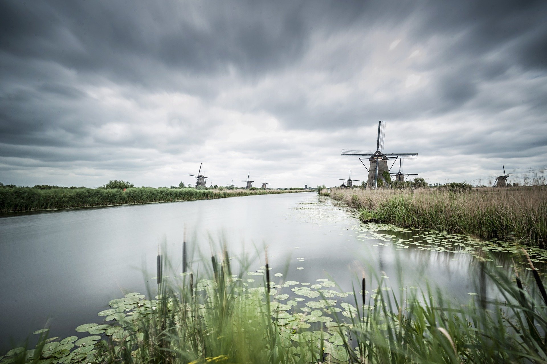
Boost text engagement with an image
An image helps draw the eye, increasing the chance of users engaging with your message.

Choose landscape images
Thumbnails work best with 600px x 450px image dimensions.

Provide image alt text
'Empty' (null) or descriptive, depending on its purpose.

Make images harmonious
That's across the page as a whole, as well as these cards.
Direct users to related content
Showcase links with compelling teaser copy and engaging images to enhance wayfinding.

Tease the page
Explain why it's important or valuable to the user, or how it could solve their problem.
Action-orientated CTA
Impactful titles
Inspire users to travel to the content you're signposting.
Go, find, explore etc
To grab their attention
With concise, scannable sentences that are quick and easy to grasp.
Positive, specific next step
Choose a suitable layout
This component offers plenty of variations
But whether you include images, leave out links, or use titles only, all cards must include the same elements for consistency.
Match onward journey page title
Short summary of key information that encourages engagement.
Clear next stepOr use a few words to set up copy
Keep cards balanced by making copy lengths of each the same.
Action-oriented CTA
Brief, easy-to-scan titles
The cards can link to other pages or be standalone, without the URL.
Links are optional
You can have up to four columns
Though maximum word count reduces as you add more columns.
Not 'click here'
Usage guidance
Overview
A flexible tool for presenting text and links
The List Spotlights component makes it easy for users to scan for relevant content. It’s suitable for most page types.
List Spotlights presents cards in multiple columns. The cards can include:
- Text
- Images
- Hyperlinks
Symmetry is essential when using this component. What you do to one card you must do to the others. So, if you want to use an image, all the cards must feature an image. Equally, each card should contain a similar amount of text.
How to use it
List Spotlights is a flexible component offering many different options.
Add a heading and subheading
You have the option to set up your cards with a heading and subheading. The heading must not occupy a full line – this is important for readability. Use a maximum of ten words.
The subheading should contain more words than the heading. For example:
- Heading:Our products
- Subheading:We offer a full suite of M&A solutions
Write a description
Use the description box to add supporting copy to your headings, if required.
Keep to a maximum of three full lines (about 120 characters).
Add a new card
Choose ‘add cards’ to create a new card. Use the ‘title’ text field to name your card.
The card can link to another page or be standalone.
If the card links to another page, the title should match that page’s title, so users know they’re in the right place. Otherwise, the title should be a short phrase that sets up the rest of the copy – use a maximum of ten words.
Write supporting copy
The subtext field is where you add the supporting copy. Keep this to under four lines. The recommended maximum word count depends on how many columns you use:
- Two columns – 45 words
- Three columns – 30 words
- Four columns – 19 words
The subtext of all cards must occupy the same number of lines – this is important for achieving symmetry.
Make a linking button
Start typing your page title into the ‘link URL’ text field. Select the page when it appears in the dropdown menu.
Use the ‘link text’ text field to write your button copy. Make sure your button text is clear and actionable. Good examples include:
- Contact us
- Get in touch
- Find out more
Add an image
Images draw the eye, making it more likely that users will read the nearby text.
It's important to maintain symmetry. So if one card features an image, then each card must have one.
For more information about uploading images to the CMS, see the ‘Image Guidelines’ advice.
Recommended image specifications
| Format | Orientation | Dimensions | File size |
| JPG | Landscape | Width: 600px Height: 450px | <100kb |
For more information on how to use images in the CMS go to the Image Basics page.
Do's and don'ts
Do
Keep content concise
Short and scannable items work best.
Don't
Don’t use random images
If adding a thumbnail, ensure it complements the content.
Don’t add unnecessary links
Linking is optional. Only add a link if it adds value. It’s fine for cards to just contain text.
Don’t use weak link text
Link text should be clear and actionable. Say ‘find out more’ instead of ‘click here’.