
Multi-link Grid
Encourage user journeys
Best practice demos
Right-hand side view
Example 1 Multi-link Grid
Example 2 Multi-link Grid
Example 3 Multi-link Grid
Example 4 Multi-link Grid
Example 5 Multi-link Grid
Example 6 Multi-link Grid
Encourage an action
Expand on why taking a specific action makes sense.
Right-hand side view - with images

Example 1 Multi-link Grid

Example 2 Multi-link Grid

Example 3 Multi-link Grid

Example 4 Multi-link Grid

Example 5 Multi-link Grid

Example 6 Multi-link Grid
Ask a question
And offer a next step (e.g. we'll get back to you).
Full width view
Example 1 Multi-link Grid
Example 2 Multi-link Grid
Example 3 Multi-link Grid
Example 4 Multi-link Grid
Example 5 Multi-link Grid
Example 6 Multi-link Grid
Outline options
Explain why users should take the next step.
Full width view - with images
Example 1 Multi-link Grid
Example 2 Multi-link Grid
Example 3 Multi-link Grid
Example 4 Multi-link Grid
Example 5 Multi-link Grid
Example 6 Multi-link Grid
A heading that inspires action
Add some additional context.
Usage guidance
Overview
Encourage user journeys
The Multi-link Grid is a wayfinding tool that’s typically used on homepages. For most other pages, List Spotlights is a more effective option. However, the Multi-link Grid can add variety to pages with multiple outward journeys.
The Multi-link Grid pulls through pages and presents them as a grid. There are four display options to choose from:
Right-hand side view
Present links as page titles in the right-hand side of the screen.
Right-hand side view – with images
Links appear as a page title and a thumbnail image on the right-hand side of the screen.
Full width view
Present links as page titles across the centre of the screen.
Full width view – with images
Combines the page title with its thumbnail image, displayed across the centre of the screen.
How to use it
Prerequisites
Before adding the component, the pages you want to link to must be set up correctly. Go to the individual page and make the following checks:
Is the page title correct?
The page title will be displayed on the link. So make sure this is how you want it to appear to users.
Don’t confuse the page title with the SEO title. The SEO title is used to help search engines understand the page.
Is there a thumbnail image?
Rather than adding images directly to the component, the Multi-link Grid pulls the thumbnail image from the linked page. So if you want to display images on the Multi-link Grid, the pages you link to must have a thumbnail image.
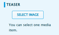
To add a thumbnail image, enter edit mode for the relevant page and navigate to the ‘Teaser’ section at the top of the page. You can import a new image or select an existing one.
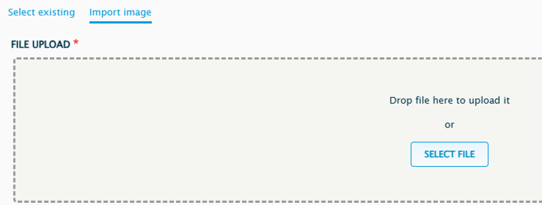
To upload a new image, select ‘import image', then ‘select file’.
Add a title and alternative text, then choose ‘select image’.
For more information about uploading images to the CMS, see the ‘Image Guidelines’ advice.
Setting up the component
Step 1: Choose your display configuration
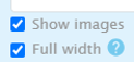
Use the tick boxes to choose how to display the links:
Right-hand side view
Leave both boxes unticked.

Right-hand side view – with images
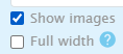
Keep the ‘full width’ box unticked and select ‘show images’.
Full width view
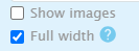
Select ‘full width’.
Full width view – with images
Select both ‘full width’ and ‘show images’.
Step 2: Add a heading
Use the heading to encourage users to click on the links.
For the right-hand side view display option, don’t let the heading run onto a third line. That gives you a maximum of 40 characters.
The full width display option can support a longer heading. Use a maximum of 50 characters and don’t run onto a second line.
Standard headings are often used when the Multi-link Grid displays sectors and products on a homepage.
Howden homepages typically use:
- In your sector, speak your language
DUAL homepages typically use:
- Our products
Step 3: Add a subheading
Use the subheading to add context to your heading.
For the right-hand side view, use a maximum of 70 characters. Don’t run onto a second line.
The full width view supports a longer subheading. Use a maximum of 150 characters and don’t run onto a second line.
Step 4: Select your pages
You’ll see two columns:
- Available entities
- Selected entities
Start typing your chosen page into the ‘available entities’ text field.
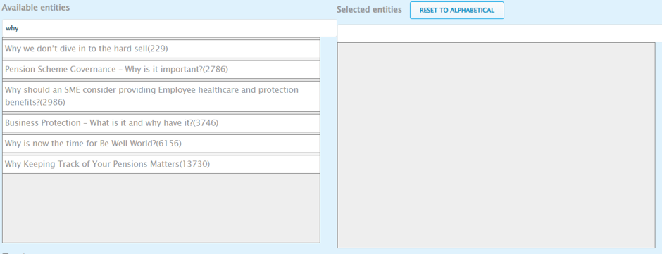
When it appears, click and drag it across to the ‘selected entities’ column.
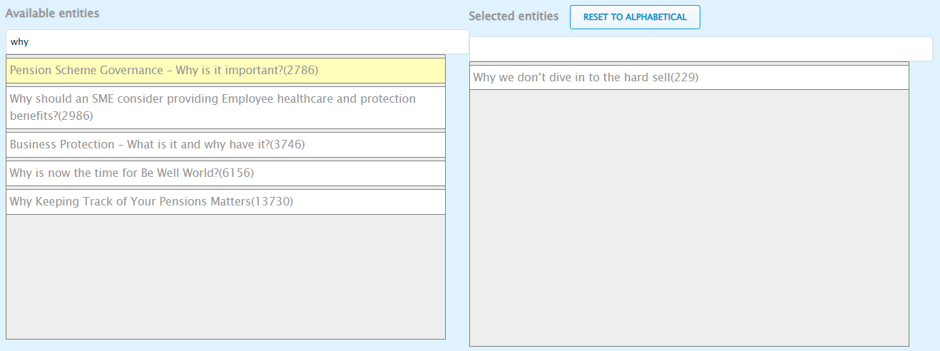
Repeat for each page you want to add.
Optional step: Add a CTA
To add a CTA, select ‘footer’.
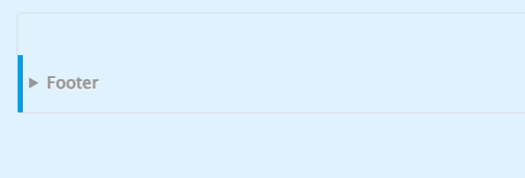
Then complete the following fields.
Heading
The heading should set up the action you want users to take.
For the right-hand side view, you have a maximum of 35 characters. Don’t run onto a second line.
The full width view supports headings of up to 65 characters. Don’t go onto a second line.
Subtext
Add some supporting copy.
Don’t run onto a fourth line. For the right-hand side view, that gives you a maximum of 200 characters. The full width view supports up to 300 characters.
CTA
Add your form’s URL to the ‘URL’ text field.
Use the ‘link text’ text field to add your button copy.
Your button copy must follow UX best practices. Effective button copy is clear and actionable. Good examples include:
- Get in touch
- Register now
- Get a quote
- Start assessment
Do's and don'ts
Do's
Check the links before publishing
Make sure all the links work and go to the right place.
Don'ts
Don’t link to unrelated pages
Only include truly related content that adds value.